
Rejected Brand System for Sequence
Enterprise billing gets super messy: legacy pricing, custom deals, and unpredictable usage all pile up, making revenue tracking painful at scale. Sequence is an end-to-end, AI-powered platform that helps finance teams run error-free revenue collection. Using “revenue rules” and custom logic, it turns complexity into something automated and predictable.
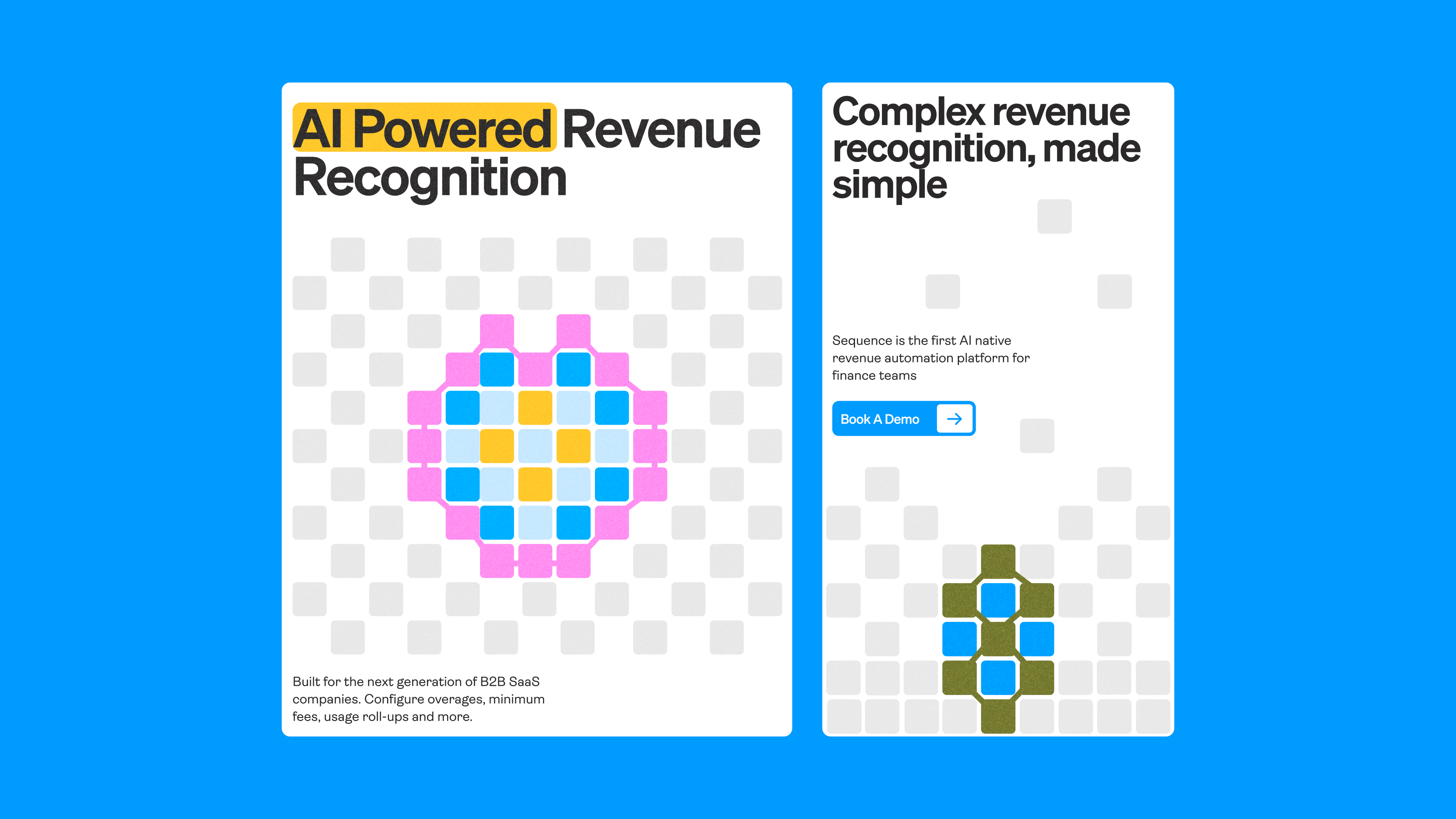
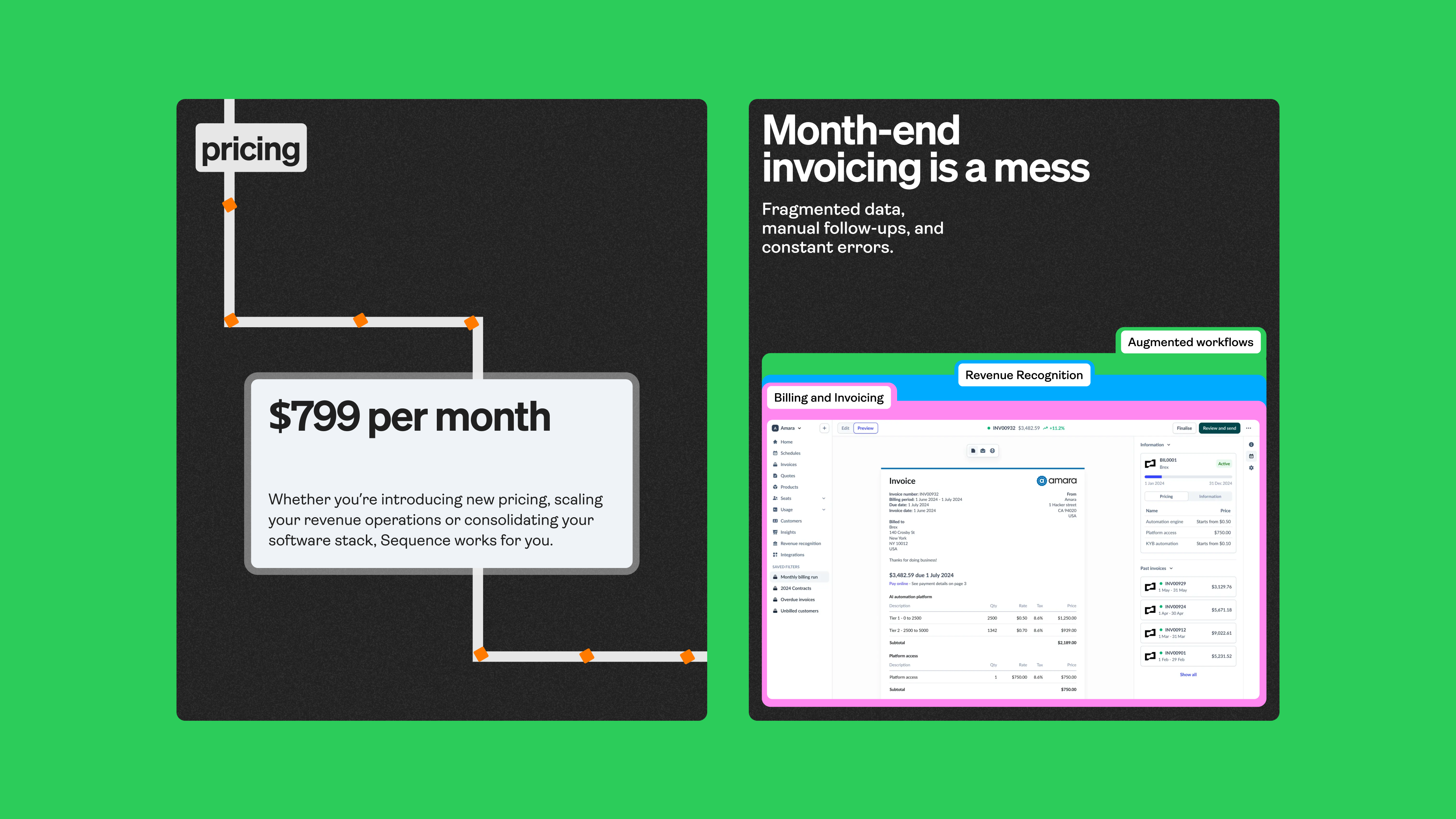
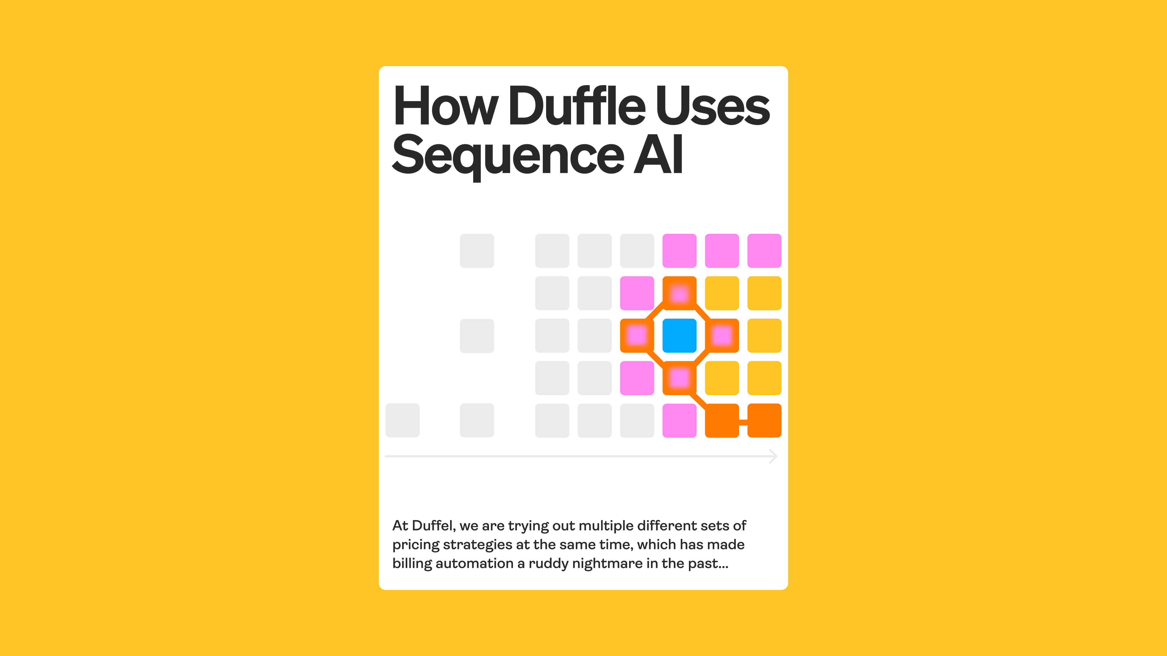
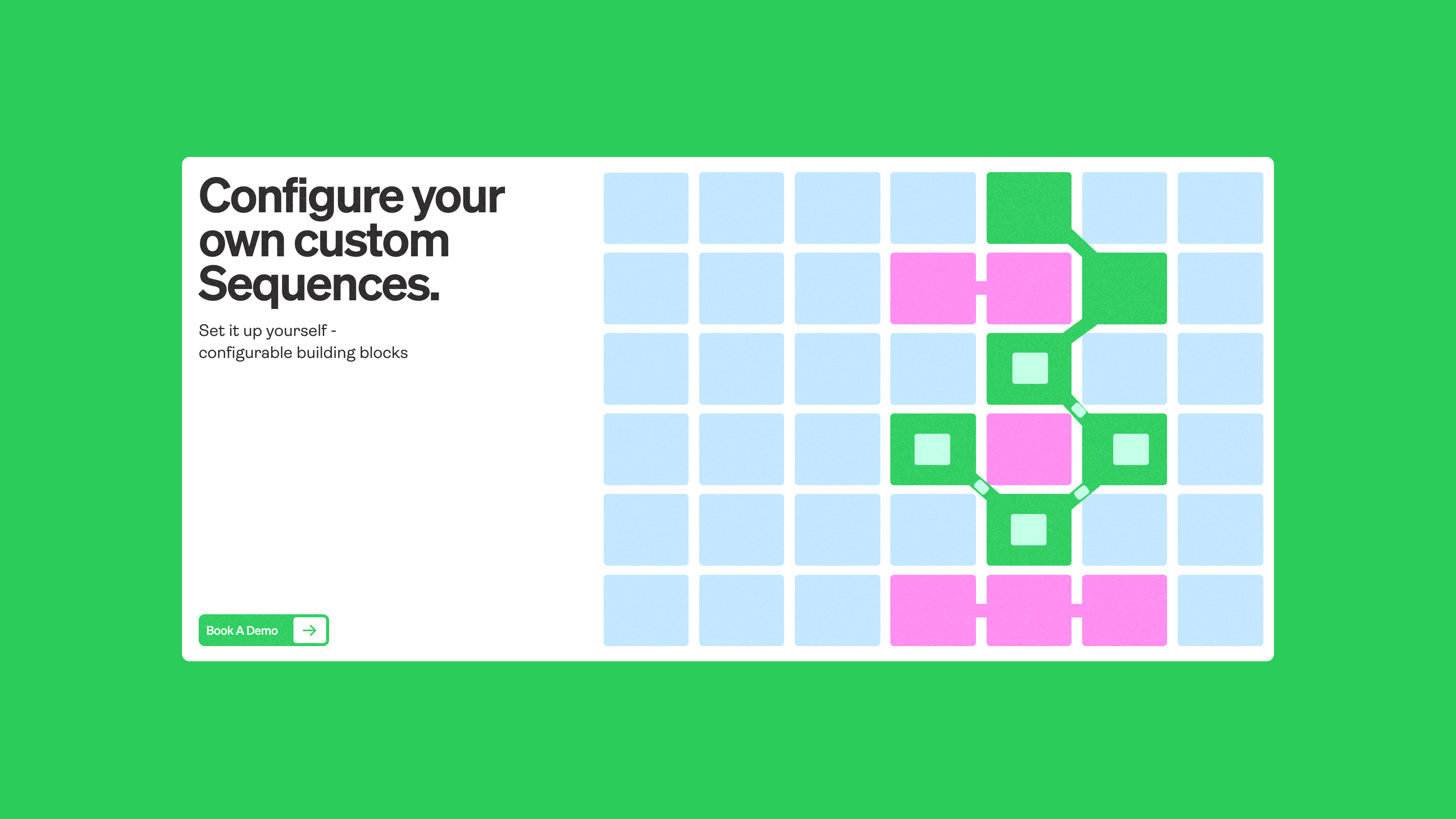
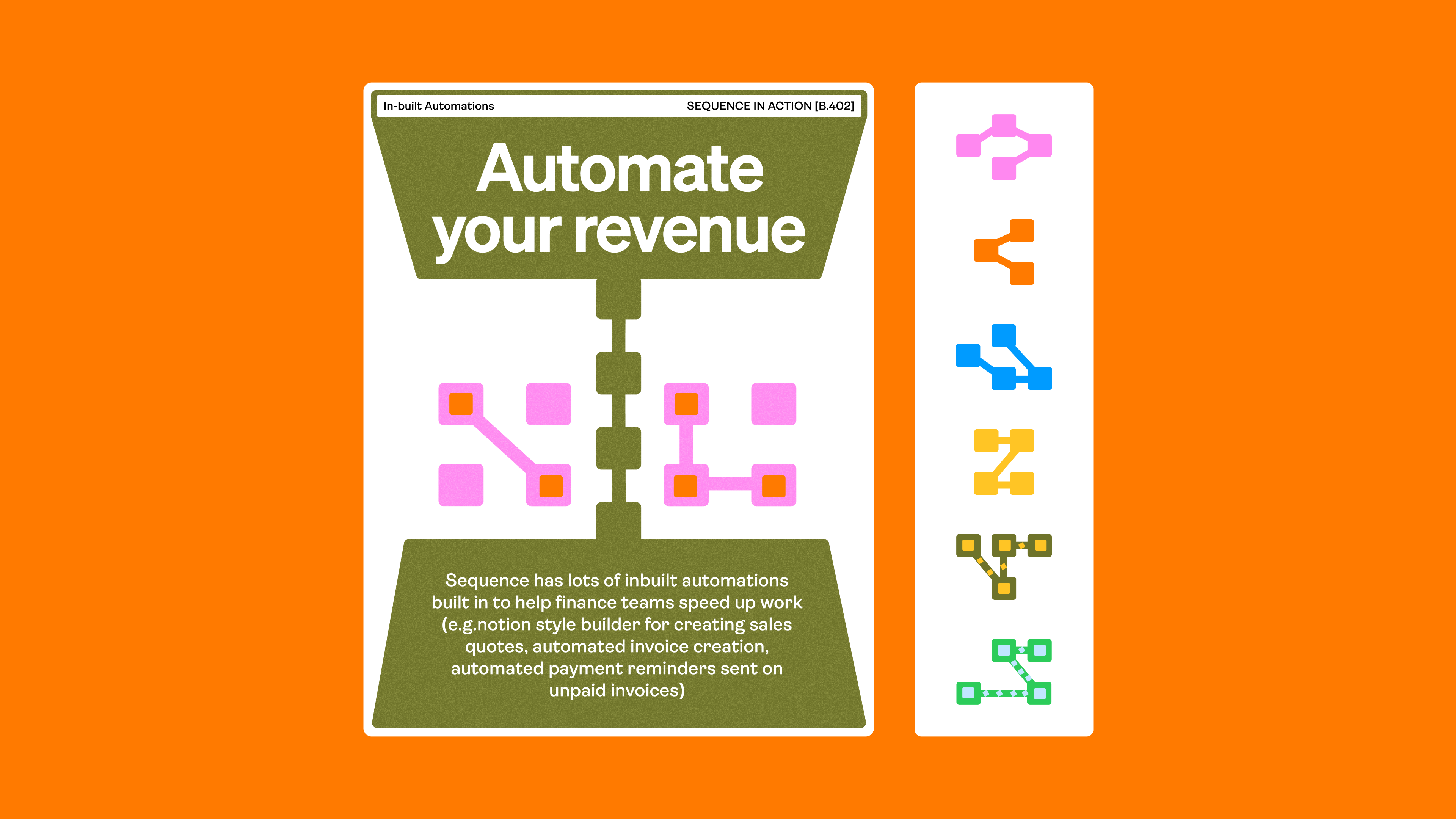
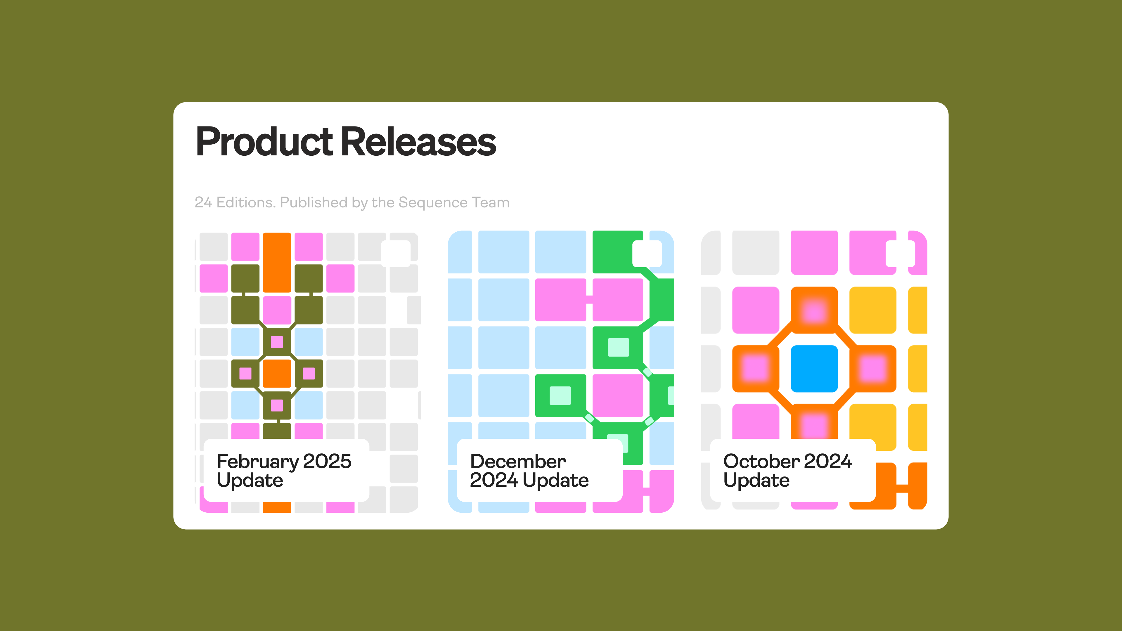
We wanted to show off how easy it is to build custom revenue logic in Sequence. The concept: a playful, modular “building block” language that made the plug-and-play nature of the platform obvious. We leaned on iconography to express modularity, and pulled in a spreadsheet motif as a nod to where most revenue tracking still happens today.
This was a vibrant and playful brand system that ended up feeling too youthful for the type of company Sequence wanted to be. Even though all the elements and the language was resonant to the product, the execution didn't feel sleek enough. I agree with that feedback and I think the direction we went in after this was a lot more accurate to the actual messaging. Still one of my faves from this year.
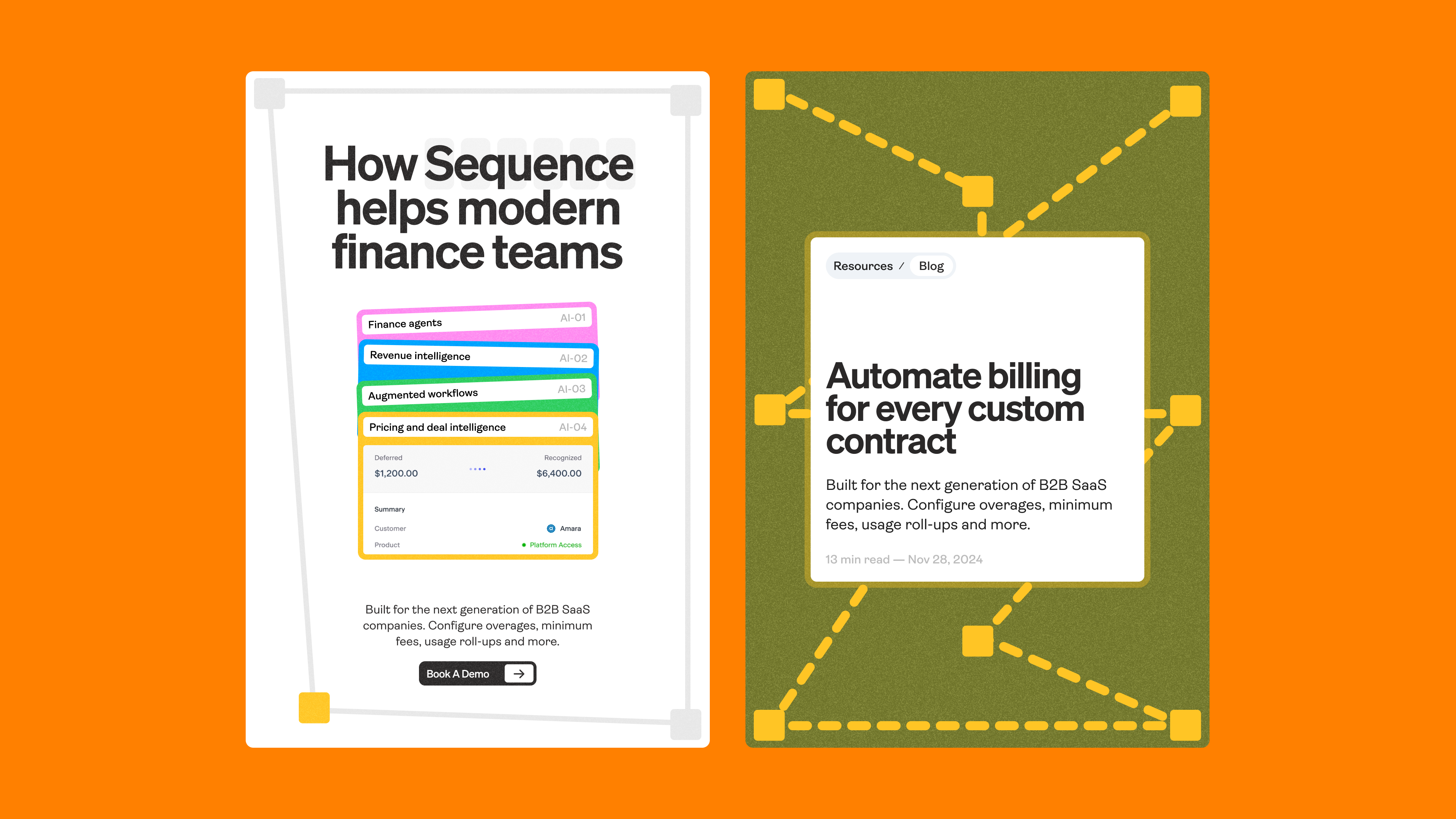
Inspo
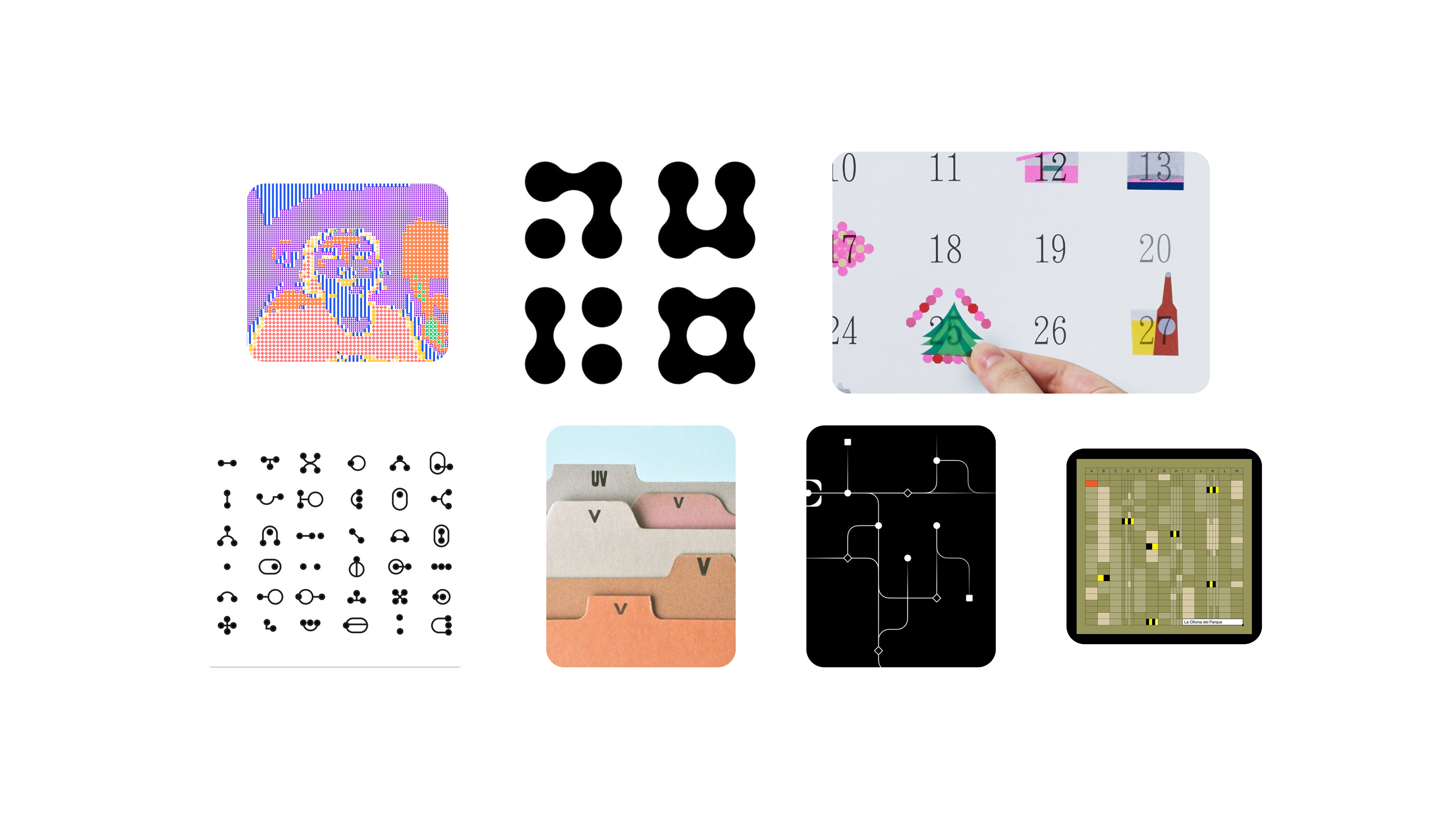
I wanted to share this little moodboard for this concept, so you can see what the pieces were that inspired this language. Modularity + old-tech + analogue vibes + excel sheet + organization.
Final Thoughts
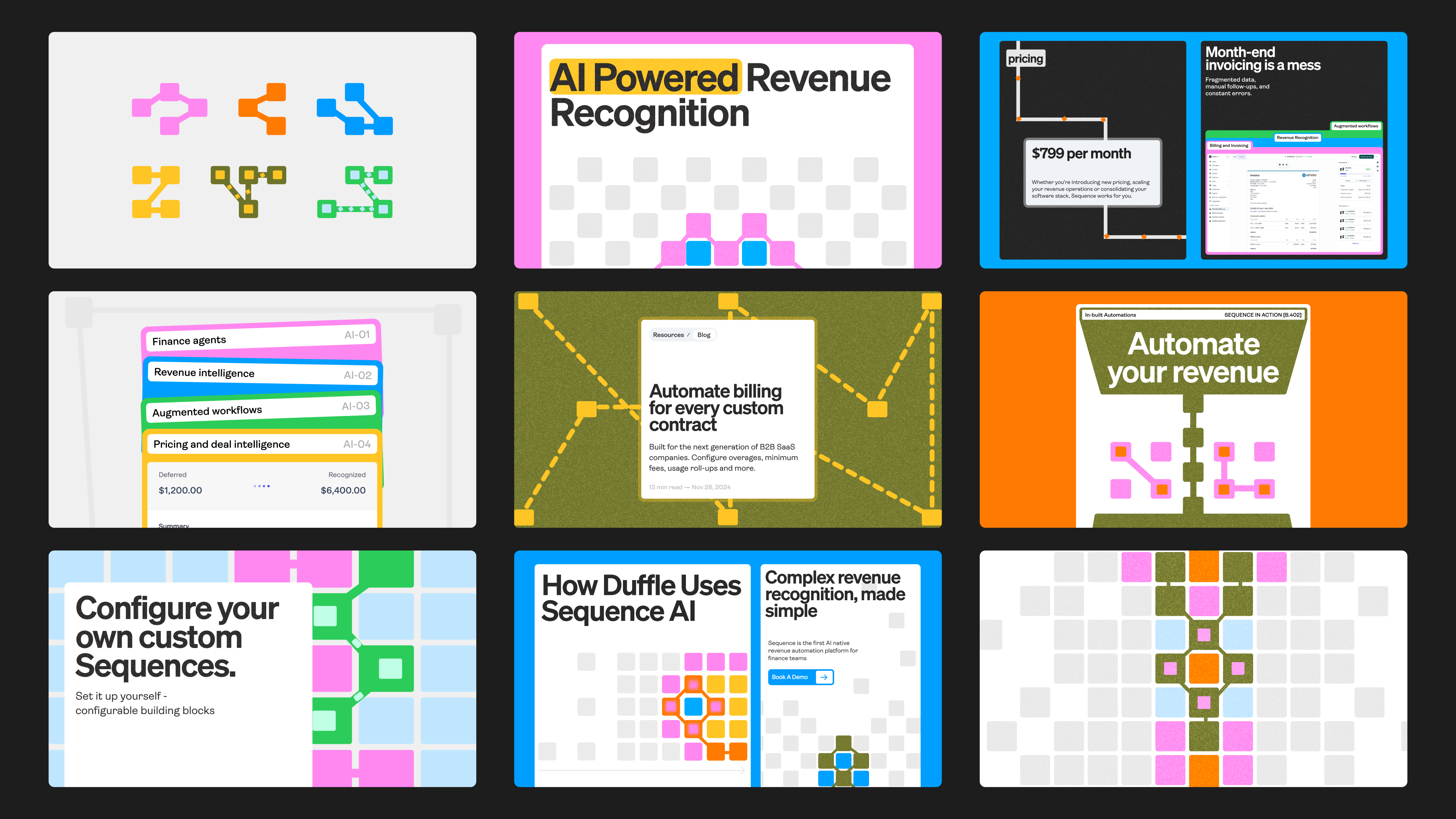
As I was making this case study, I realized the potential the brand had for scale. The pattern languages could evolve into a larger procedural motion system where we could create an infinite gallery of branded assets and also have little mini-tools to build the language further. I also think there was potential for this to scale into the website since the graphics here are so well positioned to explain the product in a more illustrative manner.
As a studio, we're super "style agnostic" meaning we'll create basically any type of brand or language, but personally I think I'm the strongest when building brands like Sequence where there's a strong illustrative pattern language that connects to the product and can scale. Anyways, I'm still excited to share the final brand work for Sequence; it's a full 360 from what you see here and I think there's a lot of new and exciting elements with that brand that you don't typically see in tech branding.
If you want to take a peak at the final brand work / more BTS stuff, hit me here and ill add you to a little list where I share all the stuff we're doing on a weekly basis

