
Rejected Brand System for Founders Inc
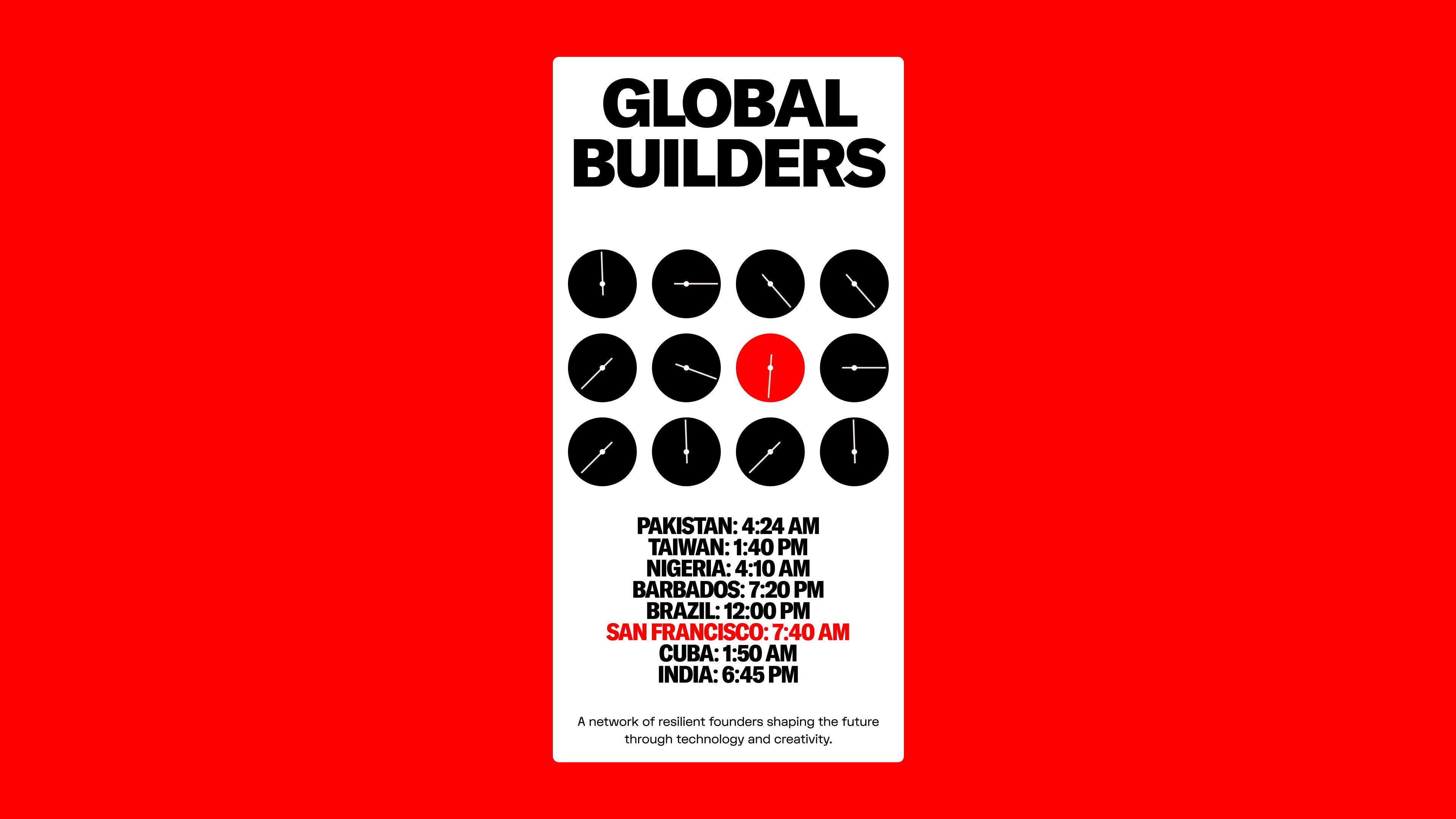
Founders Inc is a giant warehouse in Fort Mason where they bring in some of the brightest up-and-coming founders from all over the world to build in emergent tech. When you walk in, you'll see people building all types of shit - brain computers, robots, VR games. It's inspiring to walk in there, and Founders Inc has a really unique environment.
I've had the honour of hanging around in there a few times and it's a really fun and unique place. It doesn't feel like a bunch of nerds building B2B software; it's more of a lab where everyone's just having fun and creating something in a space they enjoy.
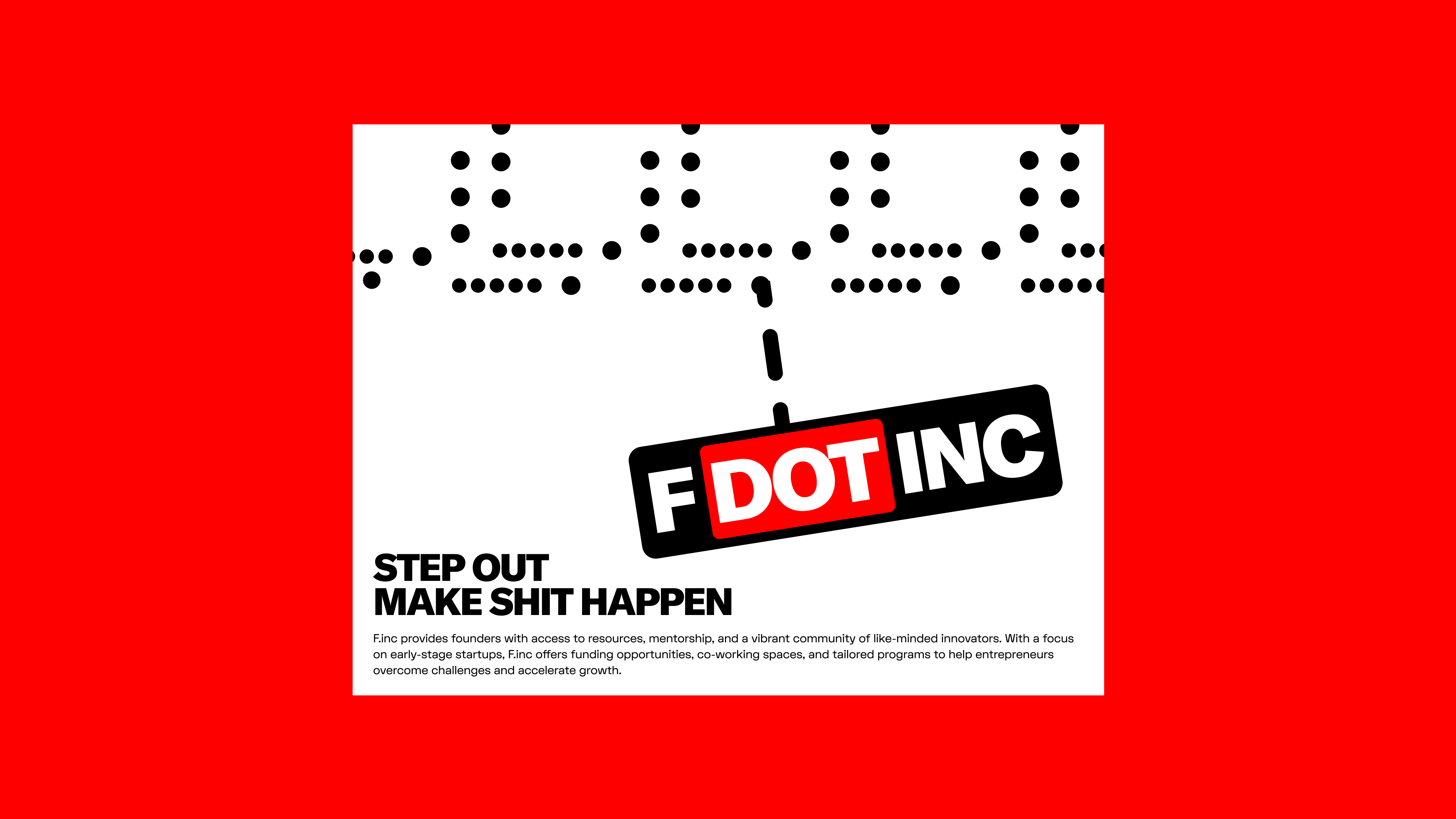
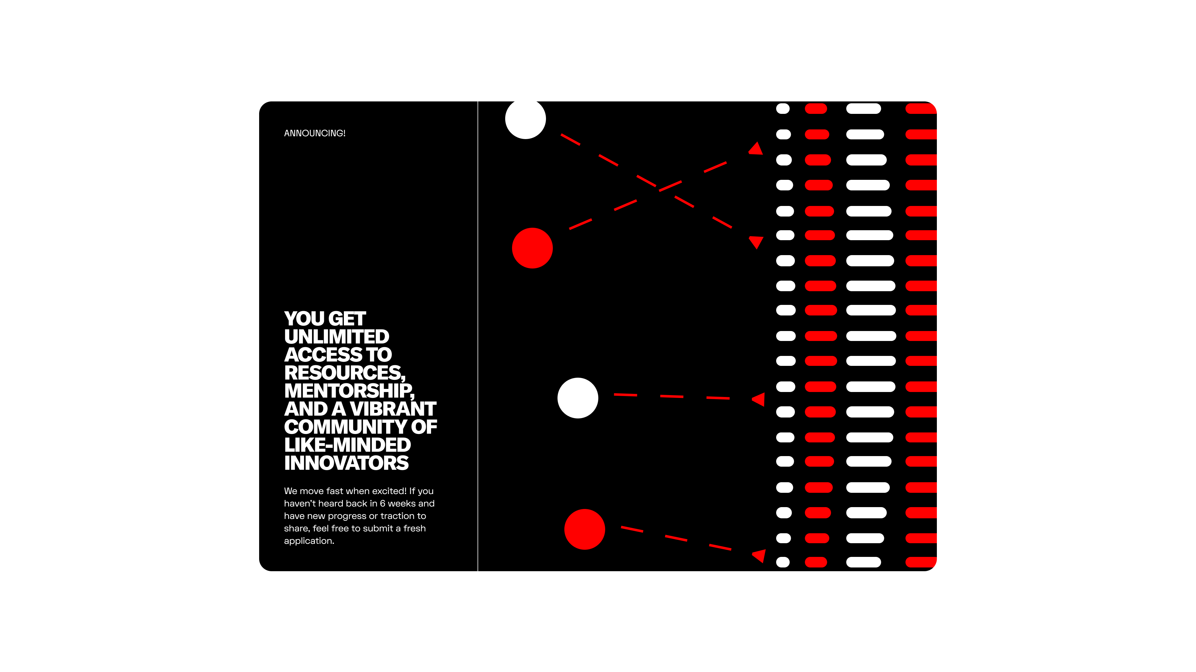
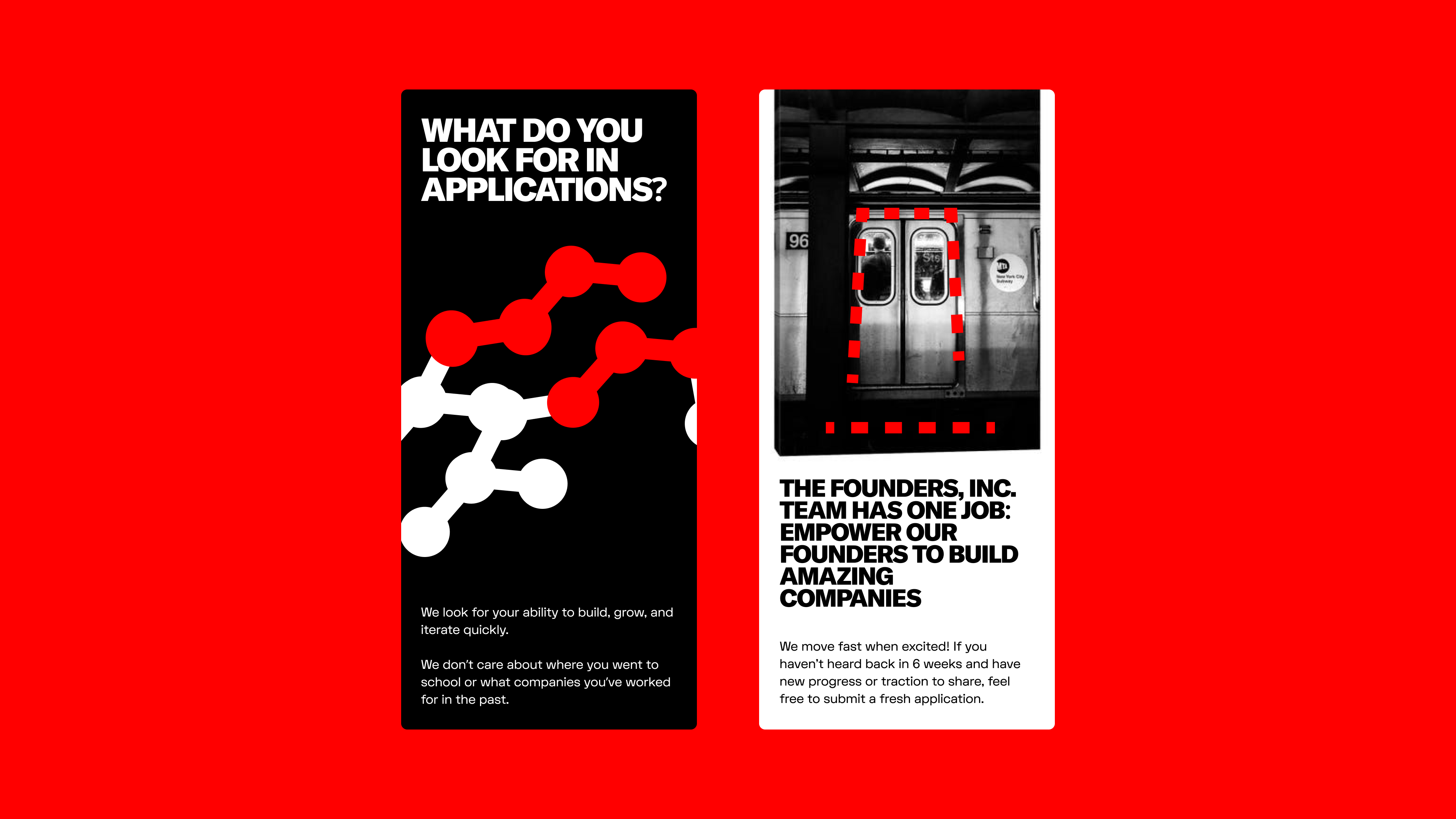
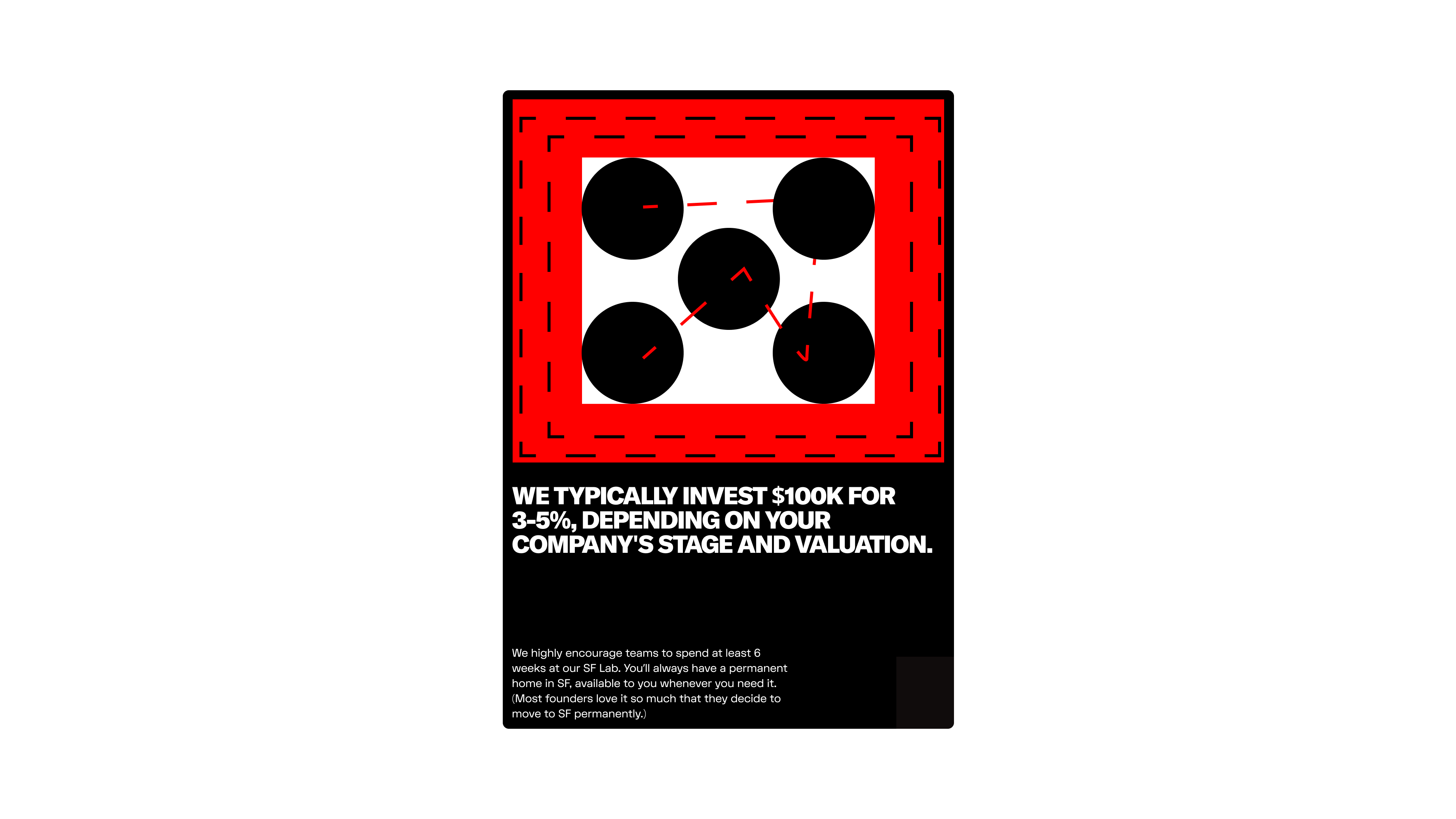
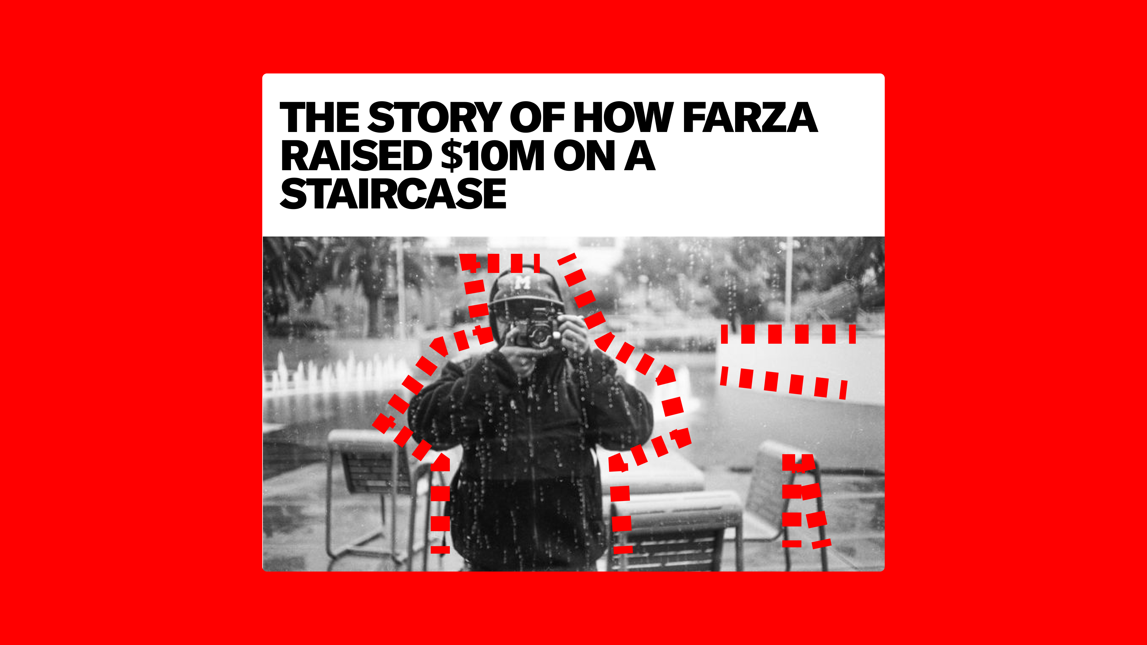
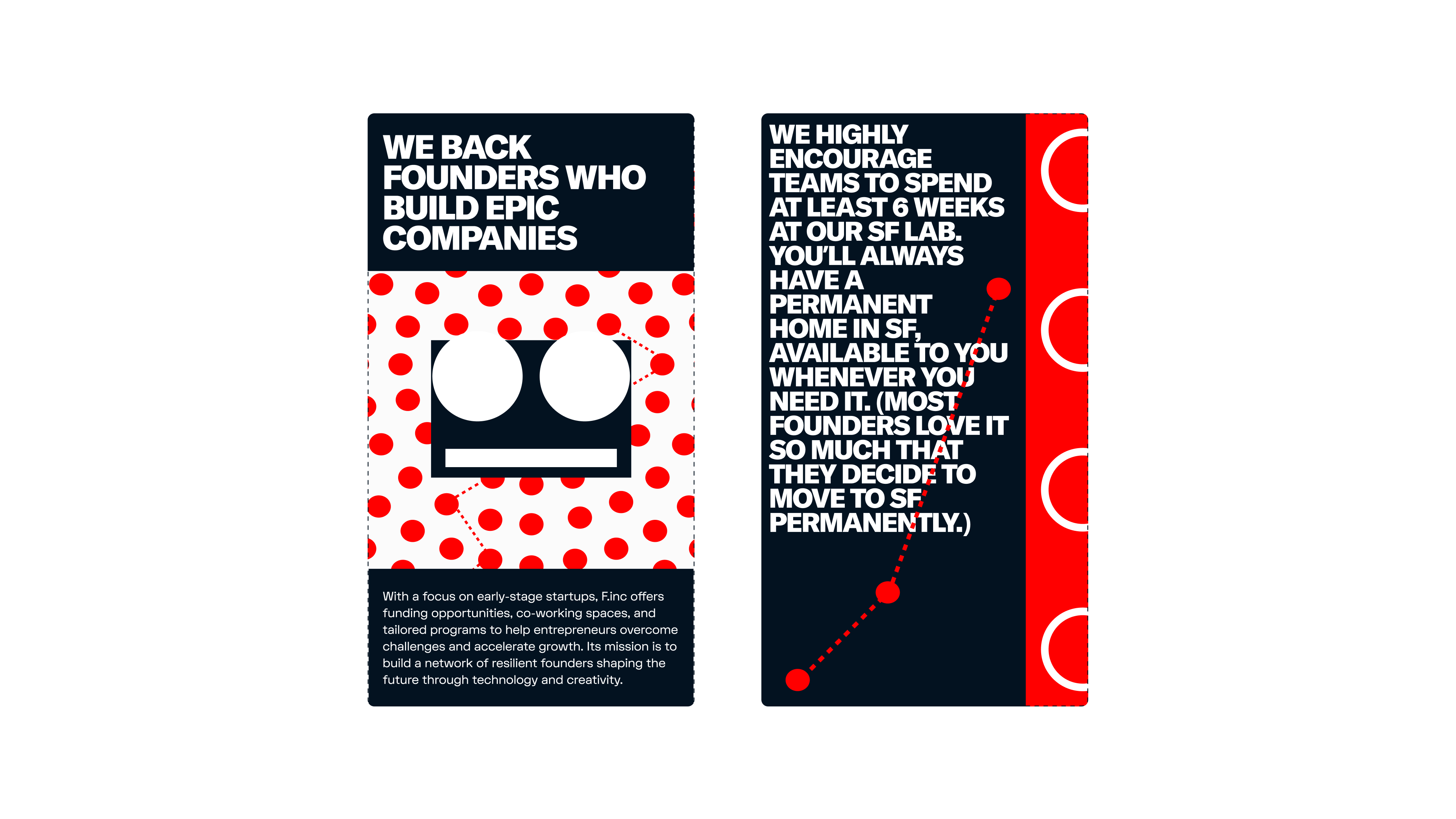
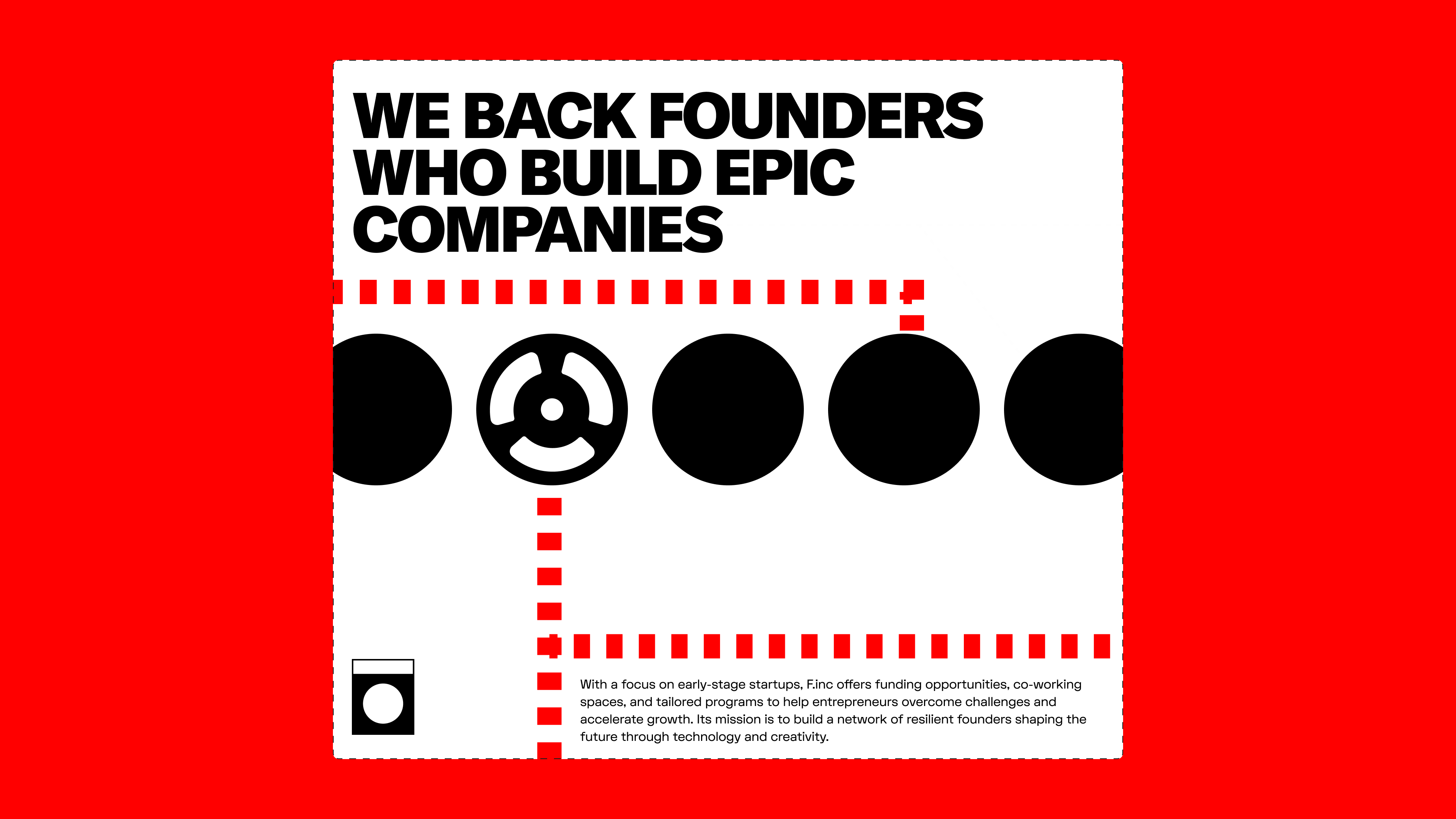
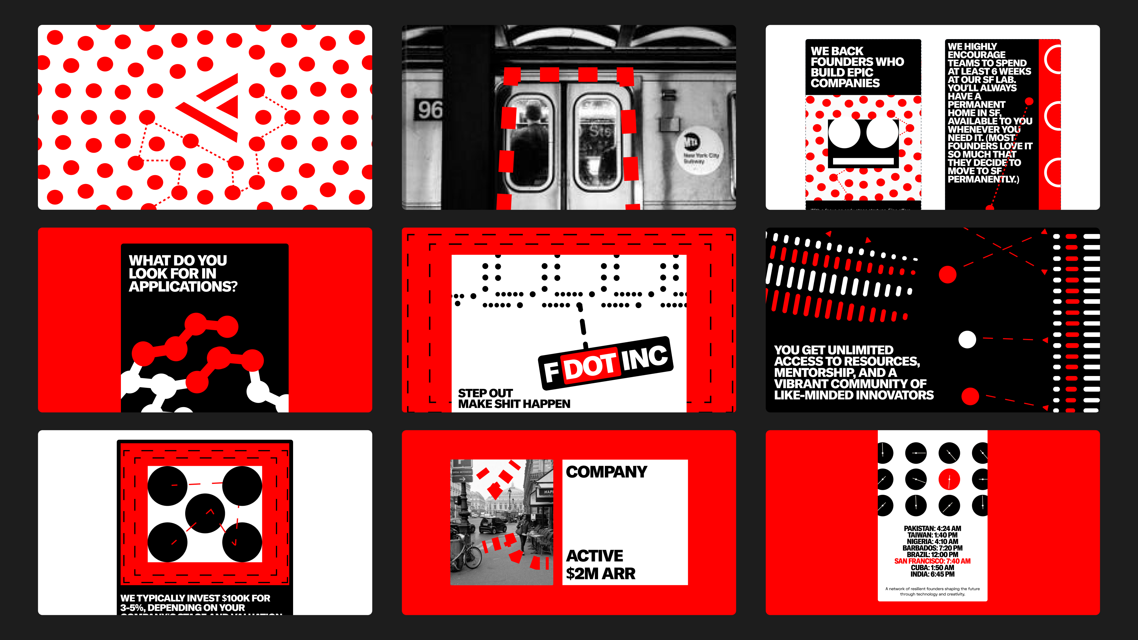
With this visual system, we wanted to play into an industrial language that felt sharp and abrasive, and still fit into the tech / robotics landscape. We wanted to build a laguage that could scale to show the different industries, types of companies, and also places the builders came form and wanted to build a pattern that could sit as an "identifier". The idea was that this system could condense down to a little icon on the website, or blow up to being a large mural in the office. The sharp red was also intentional; it's loud and abrasive and demands attention which well with the technical illustration system.
This was rejected instantly (LOL). I think it was a bit too limiting for Founders Inc. They are a lot more than a place for technical projects, and this system put them in a box + doesn't really do a great job highlighting the builders. They also have a lot of sub-brands, and this system was ultimately too opinionated + not utilitarian enough.
I've had the honour of hanging around in there a few times and it's a really fun and unique place. It doesn't feel like a bunch of nerds building B2B software; it's more of a lab where everyone's just having fun and creating something in a space they enjoy.
With this visual system, we wanted to play into an industrial language that felt sharp and abrasive, and still fit into the tech / robotics landscape. We wanted to build a laguage that could scale to show the different industries, types of companies, and also places the builders came form and wanted to build a pattern that could sit as an "identifier". The idea was that this system could condense down to a little icon on the website, or blow up to being a large mural in the office. The sharp red was also intentional; it's loud and abrasive and demands attention which well with the technical illustration system.
This was rejected instantly (LOL). I think it was a bit too limiting for Founders Inc. They are a lot more than a place for technical projects, and this system put them in a box + doesn't really do a great job highlighting the builders. They also have a lot of sub-brands, and this system was ultimately too opinionated + not utilitarian enough.
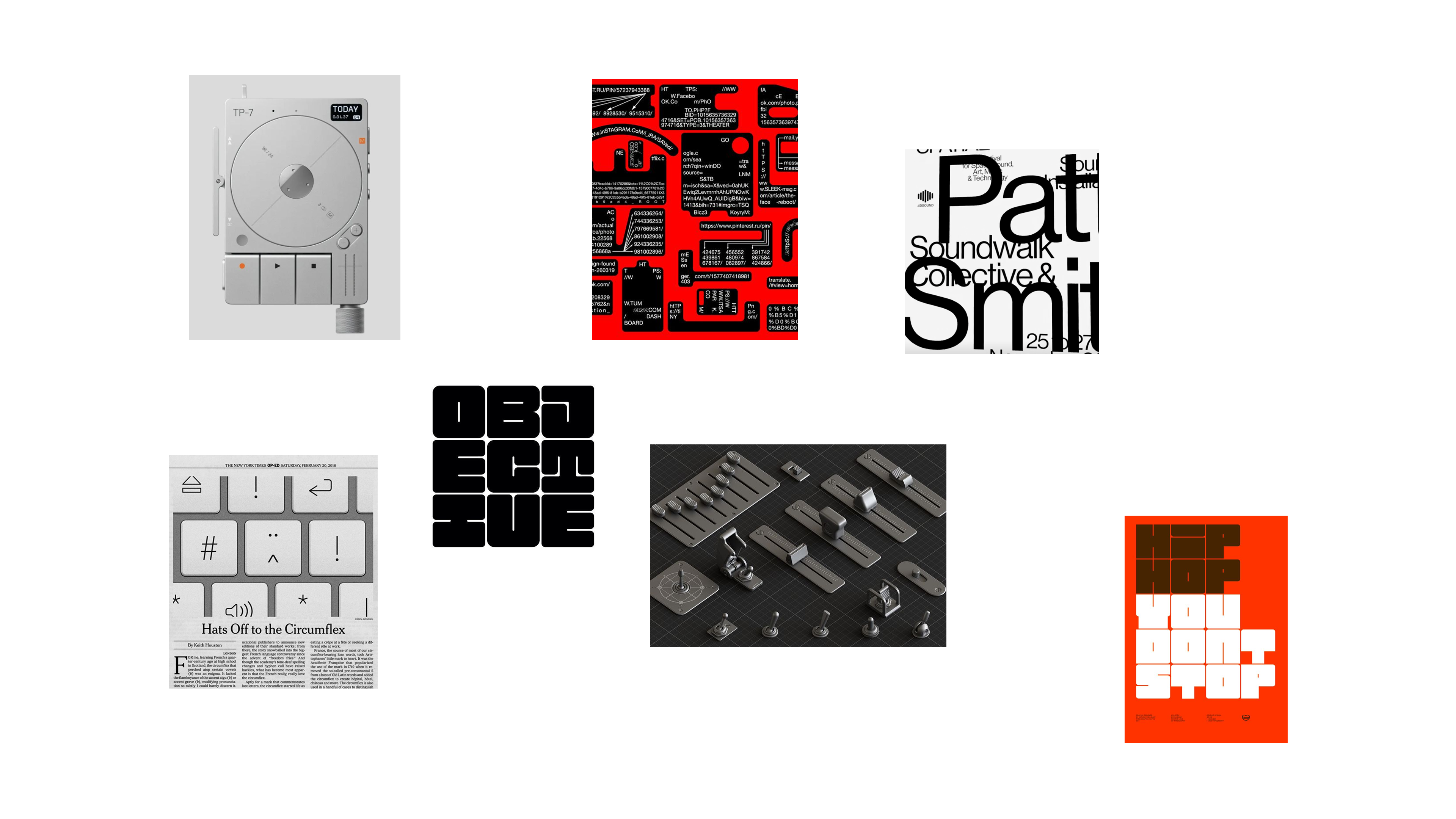
Inspo
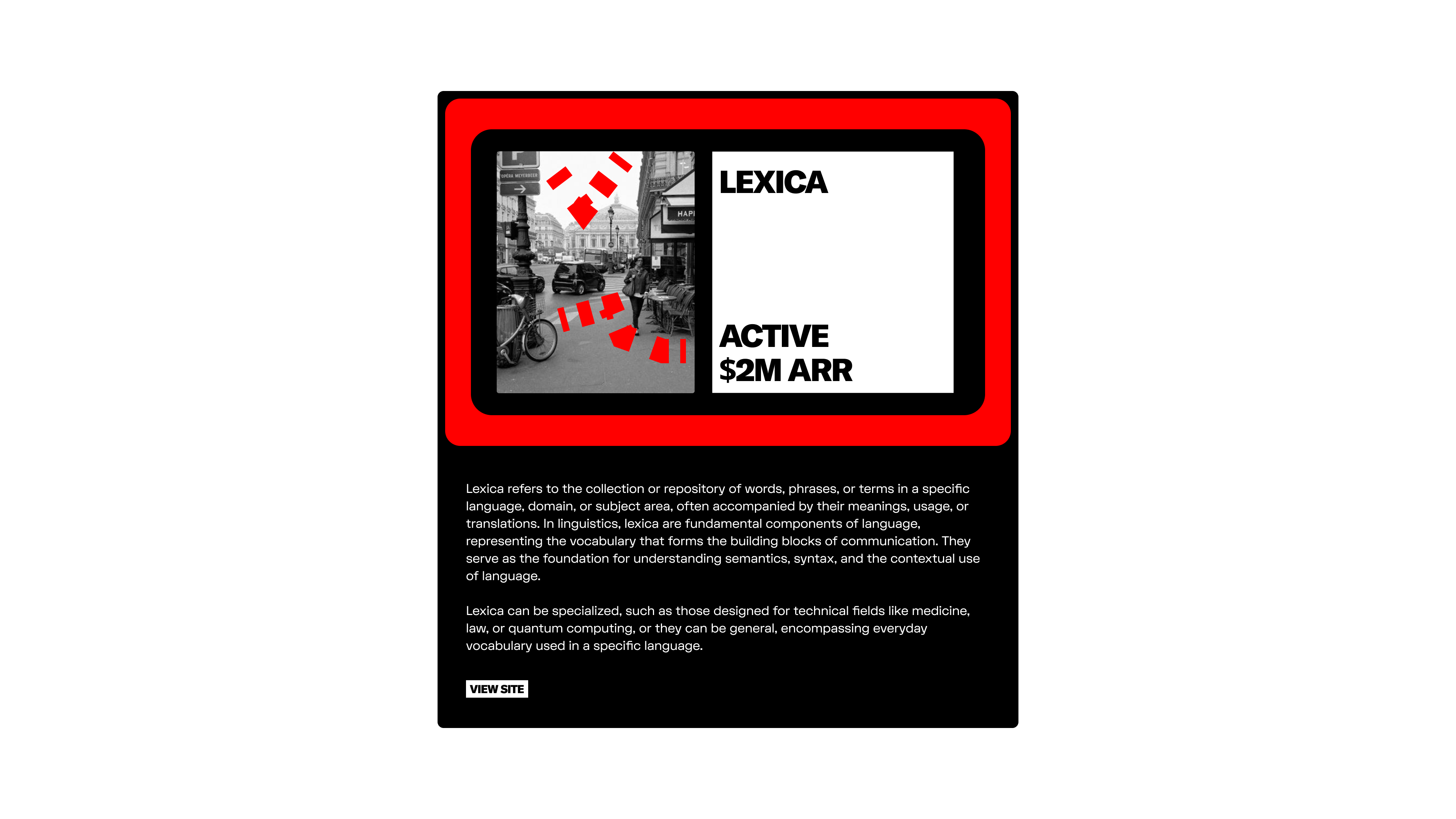
You probably see this already, but Dietr Rams was a big inspo. I also generally really liked the idea of brining some references to real robotics and 3D objects since a lot of builders were building in that space.
Final Thoughts
Don't have much else to add here, except that I actually saw Stavan (their CD) post an asset that reminded me of the language we build out. It's a lot more Serif-y and more contemporary than geometric, but the vibe was similar. So maybe this idea did kind of see some light. I think the system we built was cooler tho haha.
If you want to take a peak at the final brand work / more BTS stuff, hit me here and ill add you to a little list where I share all the stuff we're doing on a weekly basis
If you want to take a peak at the final brand work / more BTS stuff, hit me here and ill add you to a little list where I share all the stuff we're doing on a weekly basis

